
Welcome to your new Andavo dashboard
The Andavo dashboard gives you a live, map-based view of all your travelers. Quickly see who's on the move, where they're headed next, and what's happening with their trips. You can filter by date, location, or risk level to get the details you need. No more digging through reports and portals. Everything happens in one place.

How it works
Your map shows a dot for every known traveler tied to an active trip within your selected date range. One glance gives you a clear picture of where people are and where they're headed next. Even if only one part of a trip overlaps with the filter window, the entire trip is visible at a glance, from origin to final destination.
This means you'll always see all trip segments, not just the ones that fall inside the selected timeframe.
Understanding the map interface
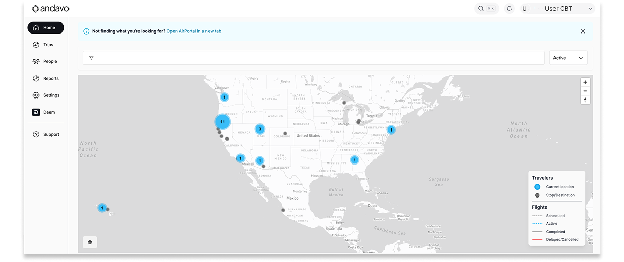
Moving colored dots representing traveler locations
Blue dots: The location of the active segment of a trip. This is where a traveler currently is or is expected to be.
For example, if a traveler flew to LAX two days ago and is staying at a hotel today, the hotel location is the blue dot.
Grey Dots: Other locations from the same trip (past or future segments).
Red Dots: Overrides a blue dot when a flight segment is delayed, cancelled, or diverted to help quickly spot problem trips.
Each dot is interactive. Clicking on a dot:
Shows a list of all travelers at that location.
Highlights which ones are currently active at that location.
Displays clickable Trip IDs to open itineraries in a new tab.
See the full path of a trip
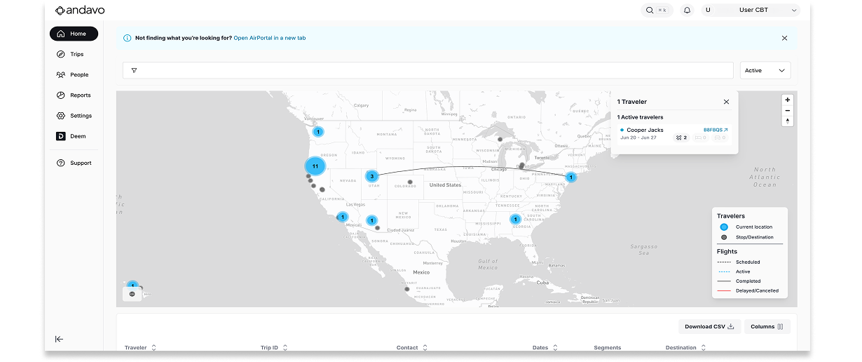
After you've clicked on a dot, you can then click on a specific trip to see the entire trip path:
Solid grey lines represent completed past segments.
Dashed grey lines represent upcoming future segments.
You can visually trace where the traveler has been and where they're going.
Planes in the air
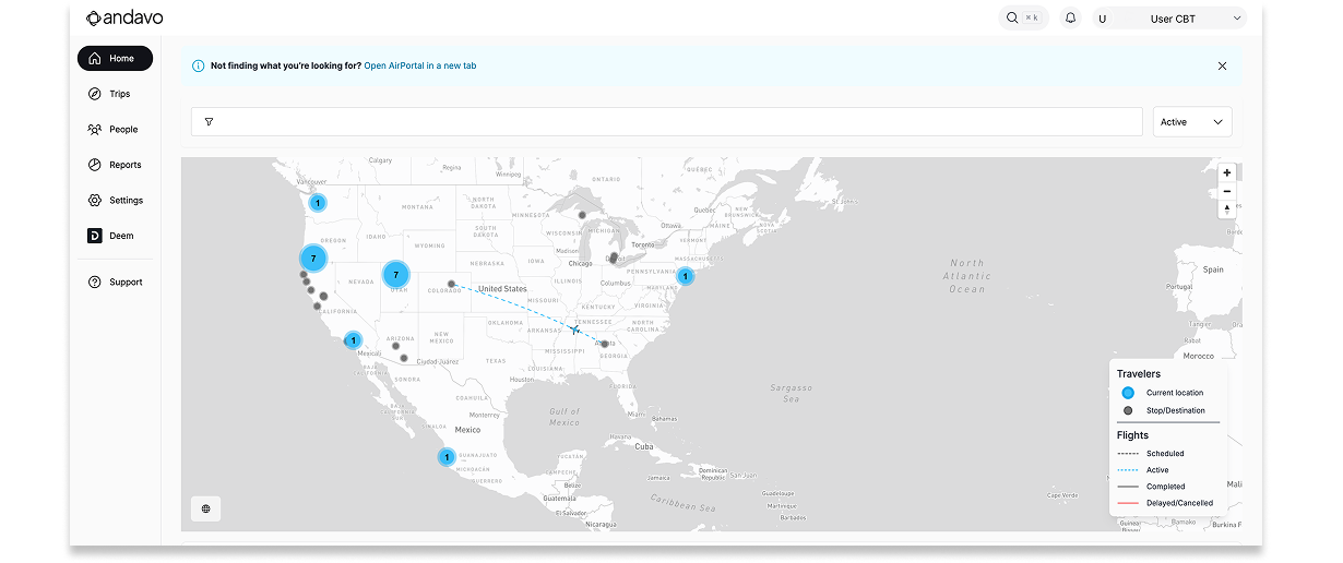
Airplane icons represent any flights currently in the air, so you can see exactly where travelers are mid-journey:
Appears when the flight has started but not yet completed.
Blue planes on dashed blue lines = flight is on time
Red planes on red lines = flight is delayed or diverted

Filter your search the way you want
Smart filters make it easy to zero in on the trips, people, and details that you need to see. Andavo offers several key filter views.
Date filters:
Choose from preset date ranges like today + tomorrow (default view), next 3 days, next 7 days, or last 3 days.
Any trips falling within your selection will appear. The map will still show the traveler's full trip path, even if parts of it fall outside of the range.

Other Filters:
Search and filter by key details like:
Airline
Airport
City
Flight Number
Flight Status (Delayed, Cancelled, Diverted)
Hotel Brand
Traveler Name
Trip ID
ANY trip or profile attribute you want (can be configured on the attributes page under settings)
Both the map and the table below update instantly as filters are applied.
See trip details beyond the map
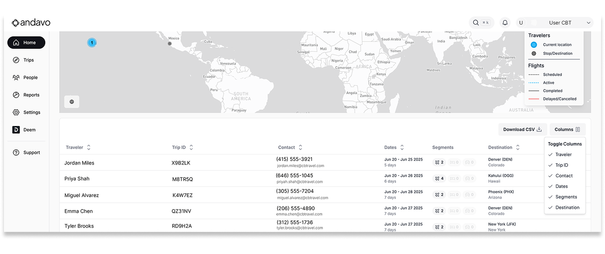
The table below the map shows you which travelers are on the move and where they're headed. It makes it easy to find key trip details and take any action needed. You can also export a CSV with full segment-level data for easy reporting.
This table provides an overview of visible trips, showing:
Traveler name (links to profile)
Trip ID (links to itinerary)
Contact info
Trip dates and duration
Segment counts (flights, hotels, cars)
First destination
It can be downloaded as a CSV file with more detailed data (e.g., segment-level info, vendor names, regions, addresses, and status)